By Sarah A. Moore and Heather Rosenfeld
A project on mapping transnational hazardous waste in North America serves as an entry point to critically rethinking the role of maps and data in the knowledge and the stories we tell about environmental injustices.
—
In 1987, the United Church of Christ’s Commission for Racial Justice released the report Toxic Wastes and Race in the United States. As a longtime progressive church, the United Church of Christ had been a leader in the environmental justice movement for over a decade. What was new about this report, however, was its use of maps and spatial data to conclusively prove what activists had been saying. People of color and poor people were disproportionately exposed to hazardous wastes. Race was the most significant factor in determining exposure.
Since this report, a central component of much environmental justice research has been mapping, demonstrating spatial correlations between marginalized populations and environmental hazards. Though there are many exceptions, environmental justice research and mapping have become largely disciplined by the constraints of the map. That is to say, environmental injustice is often identified by spatial correlations among hazards and marginalized populations and this often-static form directs research questions, data collection and analysis.
In this project, recently published in the journal Geoforum, we attempted to undiscipline such research, through a project on the hazardous waste trade between Mexico, Canada, and the United States. To do this, we emphasized mapping as a process of visual storytelling, rather than the map as a final product demonstrating the existence of environmental injustices. This visual storytelling often included making maps, but attention was given to the mapmaker’s intent, questions, and experience working with a real-life, messy dataset, as well as what the mapmaker learned about environmental justice in the process.
A Design Challenge
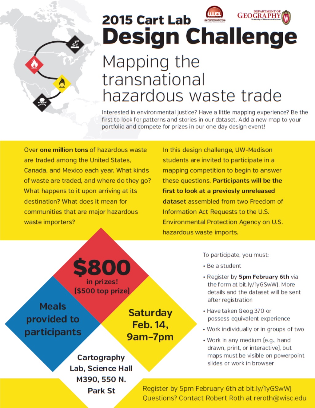
A major step in the project was a day-long mentored mapping activity: the Design Challenge. The Design Challenge brought together 17 University of Wisconsin-Madison (UW) undergraduates, graduate Geographic Information Systems (GIS) certificate students and other Masters and Doctoral students with UW faculty and staff, and an outside expert with considerable visual storytelling experience. The participants were tasked with mapping the transnational hazardous waste trade between Canada, Mexico and the United States. They were given the option of working individually or with a partner. Five two-person teams formed, with the remaining seven participants working individually. Faculty, staff, PhD students, and visiting scholars supported participants and guided them through activities during the day.
The Design Challenge: Mapping as a process of creative visual storytelling, where participants recognized their responsibility in crafting stories from large and messy datasets, and generate new understandings of environmental (in)justice. Source: Authors
To do this, we gave participants access to our novel dataset of hazardous waste exporting and importing sites in North America. The dataset was created from a series of Freedom of Information Acts (FOIA) to the United States Environmental Protection Agency. It included shipping manifests, annual reports, and other documents from companies documenting waste that was brought into or exported from the United States. Altogether, it comprised 21,184 import and export shipping entries from 2005-2012, including significant gaps, inconsistencies, and uncertainties. While we had begun making maps to understand what stories the data could tell us, we hoped that by convening the Design Challenge students would both learn about visualization and approach the data differently than we did.
This was deliberate and a significant component of our attempt to undiscipline environmental justice. Thus, beyond giving participants access to the data and a quest to find or craft environmental justice stories as a prompt, we deliberately gave them little guidance in terms of expectations. We didn’t ask students to look at specific variables, make specific maps, or use a defined style.
Undisciplined approaches to unruly data
A common theme among participants in the course of the day was surprise at the gaps in the dataset. One participant stated, “it was surprising to see the government doesn’t know where all this stuff is going.” Such statements often led to the conclusion that the dataset, and therefore, knowledge about the transnational hazardous waste trade, was “clothed, not in secrecy, but just obscurity.”
Participants did not see this as a reason to turn away from the dataset entirely, so much as a reason to question its trustworthiness. In this respect, our emphasis on undisciplining environmental justice promoted critical quantification; that is, using quantitative data while attending to their limitations . Rather than assuming the mapper was simply enabling the data to “speak for themselves,” participants recognized their responsibility in identifying, assessing, and crafting stories. Some participants turned toward other data sources to supplement the one provided, using our data as a starting point and other data sources to add context.
In many cases, participants became enmeshed in this contextual information. One student, for instance, used supplemental data she found on the Environmental Protection Agency’s website to create a “Choose Your Own Hazmat Adventure” game. In this, players would choose a stakeholder’s perspective from which to understand the transnational hazardous waste trade. Here, the author took inspiration from the dataset and created characters based on latent characteristics in it (see below).
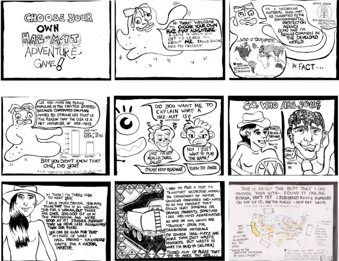
Excerpts from “Choose Your Own Hazmat Adventure” game, which unfolds the complex and unfamiliar hazardous waste industry through different stakeholder perspectives (image courtesy of Chelsea Nestel). Source: authors
Another consequence of undisciplining research was that participants took different approaches to identifying stories to tell. Five participants practiced, or intended to practice, what we call “directed storytelling.” These participants approached the Design Challenge with a topic in mind. They often conducted background research on hazardous waste and environmental justice before turning to the dataset at all, and drew more extensively on outside sources (e.g., the US Census).
A more common path, though, was “undirected storytelling.” Here, students focused on the dataset itself, poking, playing, or mining for stories. Three of the directed storytellers turned to the undirected approach partway through the day, because their original plan wasn’t working.
Both approaches contributed to undisciplining research, and both, of course, had their limits. Directed storytelling departed from the common misconception that data “speak for themselves,” in that these participants often had specific, but open-ended questions about it. Undirected storytelling allowed for even greater exploration of the quirks of the dataset and its inconsistencies.
Undisciplined Stories
Though we emphasized the process of data exploration, play, and creativity, the products, too, contributed to undisciplining research. We analyzed the visual stories participants created, finding three themes. Themes and map titles are excerpted from our Geoforum paper.
Visual stories and themes from the Design Challenge.
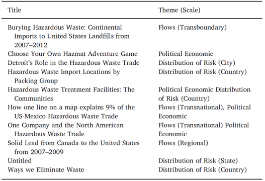
The transnational hazardous waste trade in the US City of Detroit. Waste treatment facilities are mapped against the percentage of white population (image courtesy of Kristen Vincent). Source: Authors
First, five teams visualized uneven distributions of risk at multiple scales. These were most similar to the initial United Church of Christ report, exploring relationships between race, class, and waste facilities. All of these point to the significance of context and scale. Concerning context, all participants moved beyond the dataset itself to think about waste importing communities. Likewise, participants used different scales of analyses, from focusing on census tracts in one specific city (Detroit), to looking at the demographics of zip codes across the nation.
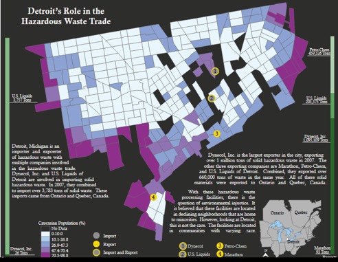
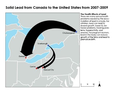
A second theme was waste flows. Half of the teams mapped flows of waste between specific import and export sites. Some of these emphasized border crossings: how and where waste traveled across national borders. Others emphasized specific materials, such as lead. A third theme was political economy, developed in four of the projects. Two teams focused on specific companies, such as the evocatively named Clean Harbors. These stories pointed out the significance of corporate consolidation in the waste trade. Another project in this category was the aforementioned “Choose Your Own Hazmat Adventure.”
Volume of flows in lead between Canada and the US. Here, the size of the flow line at the arrow is scaled in proportion to amount of lead by weight moving between sites. (image courtesy Gillian Cooper and Clare Trainor). Source: Authors
This visualization examines the influence that one company, Clean Harbors, has over the transnational trade of hazardous waste. (image courtesy of Osama Abdl Haleem). Source: Authors
Reflections on Undisciplined Environmental Justice Research and Education
The maps and other visual stories students created contribute to the project of undisciplining environmental justice research. The stories that showed uneven distributions of risk, especially when taken together, demonstrated that environmental justice is multiscalar. The flow maps showed how environmental injustice is not simply a matter of unequal distributions of hazardous waste, but also that such distributions happen because of specific trajectories through which waste travels. Finally, the political economic maps demonstrate the significance of corporate power in producing environmental injustice.
The Design Challenge also proved valuable as a pedagogical exercise. Students came to the challenge with some common background in cartography and/or GIS, but less background in environmental justice, risk, or political economy. Though given little instruction on these critical themes, students were able to come to them by themselves, in a way that was arguably more memorable than simply lecturing on political economy and environmental justice.
We also made a mistake, which proved comical and educational, and wholly in keeping with the process of undisciplining environments. We asked students to find stories about “environmental justice” — which, to us, is a scholar-activist movement towards justice, a significant part of which is recognizing injustice. Students turned out to be baffled by this, often saying that they were more frequently finding stories of environmental injustice. While this was our mistake, it enabled students to define and identify injustice, and it also provoked conversations where they wanted to learn more about it.
Sarah A. Moore is Associate Professor of Geography at the University of Wisconsin-Madison. Her research interests include environmental justice, waste politics, economics and regulation. With Paul Robbins and John Hintz, she is co-author of Environment and Society: A Critical Introduction from Wiley (third edition forthcoming).
Heather Rosenfeld is currently a postdoctoral researcher in the Metric Geography and Gerrymandering Group at Tufts University. She joined MGGG after completing a PhD in geography at the University of Wisconsin. In addition to mapping, her research interests include citizen science, the place of technology in participatory processes, and social/environmental justice. She has additional projects on critical animal geographies and environmental justice